Saturday, March 31, 2012

The Frugal Scrapper

 Blame it on the fact that there are no LSSs in my area, and ordering supplies online could mean a week or more before that precious box hits my doorstep. Whatever the reason, I'm a frugal scrapper. And when designing with kits, I seem to be especially frugal. I cut out middles when I only need a border. I carefully save the perimeter and use the middle when I only need a small rectangle for layering. When working on my first layout with Scraptastic Club's April kit, I needed to punch a red circle. This is what I did:


I estimated the area of cardstock that would be covered by other papers and/or embellishments and punched the circle where it wouldn't show later. And yes, you can also see that the dark grey cardstock forming the bottom "layer" of my page has the middle cut out! Another frugal way to eliminate waste and bulk from my page. The grey center was then used for my title and to mat the photo. And in the end, you'll never know that there are holes underneath.

Anything to stretch those supplies!

Friday, March 30, 2012

Cowpokes

I'd like to share a page about two little cowpokes, my youngest son and one of his cousins. They are close in age, in the same grade at school, but live hundreds of miles apart. Yet, they are such good friends. Every summer, when we go to the beach with our big extended family, all of the cousins get to spend time with each other. It's non-stop fun: in the water and out, riding the waves, digging in the sand, playing video games, watching movies, taking long walks on the beach with Uncle Chris, etc. I love that we can do that. It's great when the kids are close to their cousins, making happy memories together.


The western theme of October Afternoon's Sasparilla collection inspired my title, Like Roy & Dale. The CardMaker's Hand-Lettering Book inspired my title lettering!


Saturday, March 24, 2012

Pretty in Pink, Peach, Aqua, etc.

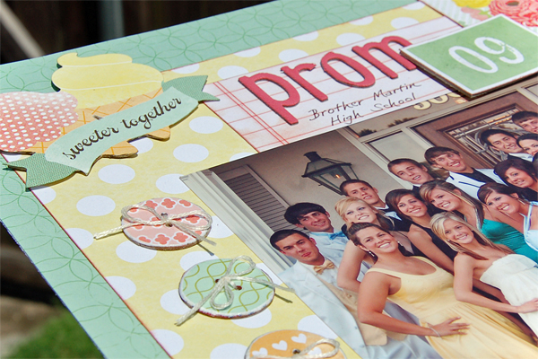
Although I rarely scrap with pastel, girly colors, I was immediately enamoured with the Dear Lizzy paper collection. You could say that it was love at first sight. Those mason jars had me, and I could only imagine the possibilities! After debating with myself for a couple of weeks, I gave in and ordered some of the pretty pastel papers and a booklet of stickers. Digging through my photos, I found a few that I thought might work.

A picture of my son, his friends, and their dates on the night of their Senior Prom had a multitude of pretty colors like those in the paper collection. Then I spotted the "Sweeter Together" sticker, and a page was born.


To continue with the celebratory theme, I cut out one of those mason jars and filled it with colorful confetti punched by hand from several of the other papers. Ouch.


Jenni Bowlin chipboard buttons were covered with patterned paper, sanded, coated with gloss medium, and tied with floss.


Hmmm...I could get used to this. Pretty and girly is not a bad thing, except maybe if you're scrapping a 12 year old boy. ;)

Thursday, March 22, 2012

My Process

I love to hear about various scrapbookers' creativity process. It's intriguing. Some scrapbookers actually take you through their page development step by step. It's fun to see the progression from blank page to finished product. However, once I get rolling on a layout, I don't think to stop and take pics! But I did think to take a photo before I began this time.

Step One:


This is how I get started. I usually choose my photo first, but, in this case, I chose the Dear Lizzy collection (which arrived in a recent order) and found a photo that worked with it. I cut out some bingo cards from another paper line, added a couple of papers that coordinated with Dear Lizzy, then gathered letter stickers, borders strips, buttons, ric-rac, trim and more, laying it all out in front of me. Of course, not everything makes it onto the finished page.

Next, I shuffle the papers around to determine which look best abutting my photo, near my photo, further from my photo, or as a background and began to formulate a layering plan. Sometimes I'll dig around and find additional papers that coordinate.

Finally, I make that first cut, and then there's no stopping. I'm committed. I cut and layer, layer and cut, and set up the entire page on my desk, title and all, without adhering a thing. Before I get out the adhesive, I need to see how it all will come together! Sometimes I'll even have to take a picture so that I can remember how to reassemble all the layers as I work on adhering them to the page. Crazy, most certainly, but it works for me.

What's your process like?

Wednesday, March 21, 2012

A Transition...

I was faithful to my journal for about a month last year, and then I let it slide...for 6 months! After that hiatus, I started the journal back up again, but felt like I needed to account for those lost months somehow. Otherwise there would be this weird, unaccounted for, gap of time. In order to transition from September 2011 to March 2012, I created a spread of pages that gives a very concise summary of those six months. On one side, I listed a few events corresponding to each. On the other side, I chose three unique events and highlighted them with fun papers and lettering.


I have to give a shout out to my good friend, Nancy Burke, who co-authored a lettering book that inspired the writing on these pages. Her book, CardMaker's Handlettering Workbook, with its many  examples gave way to the variations shown in the close-ups below.


It was so much fun trying out the decorative handwriting styles on these journal pages, without worrying about messing up something REAL important, like a layout that I had just spent hours creating! This is one of my favorite things about this type of journaling...the freedom it gives to drag out my creativity and simply play with papers and supplies.

Tuesday, March 20, 2012

Washi Enabler Warning!

I know this is old news for most, but I've just discovered Washi Tape! Yes, I had seen it before. A sweet RAK arrived in the mail several weeks ago from a scrappy friend...and she used some pretty Parisienne themed Washi tape on some of the items inside. I've also noticed it used more frequently in scrapbook galleries, on layouts and in Smash books.  Yes, my attention was already piqued, but it wasn't until I shopped around and came across this brightly colored pack of mini rolls that I succumbed. Colorful gets me every time.

Etsy Listing: japanese-washi-tape-mini-starter-kit

And gosh...there's actually quite a bit of tape on each of those rolls. Now I hope I can find a lot of pretty ways to use this new-to-me product! I didn't just buy it to look good on my shelf. ;)

If you're familiar with this product, what is YOUR favorite way to use it?

Monday, March 19, 2012

Bella Citta

Bella Citta...Beautiful City. Florence was such a place. I took so many photos on our half day whirlwind tour in that city. Everywhere you turned there were ornate buildings, churches, sculptures, fountains, and bridges. I scrapped many of my photos back in 2004, right after my trip, but still had an envelope full of ones I hadn't touched. I took out a few to scrap.

I had several October Afternoon Boardwalk papers from an order placed months ago. At the time the store was out of some of the patterns but had enough to interest me anyway. Recently I ordered some more of the collection, because I especially wanted one of the patterns I missed previously, one being a yellow print. I started the page with what I had, hoping my order would come in while working on it, (because I really needed that yellow!) Finally, I got antsy with my half thought-out, cut-out, and laid-out layout sitting around, and finished the page with some yellow paper scraps from another line.


Of course, my order arrived just an hour or so later. It figures.