Friday, June 21, 2013

Live Life 24/Seven

When I started scrapbooking many years ago, I already had 5 kids and a bookshelf of photo albums bursting with memories. I quickly abandoned all hope of being "caught up" and concentrated on simply scrapping the photos and memories that grabbed my attention. I often hop around from year to year, picking out various photos to scrap. Here are two pages from my recent trip through time, both created with Scraptastic's Carry On kit.

The first layout begins with a simple cardstock base, a few layers of patterned papers and a triple matted photo. The "24/seven" card works as the main title, leading into the subtitle, Every Moment of Every Day:


My favorite part of this page is the casual little banner, composed of several Ormolu pennants and a few tag shapes cut from one of the Simple Stories patterned papers. Fun stuff!


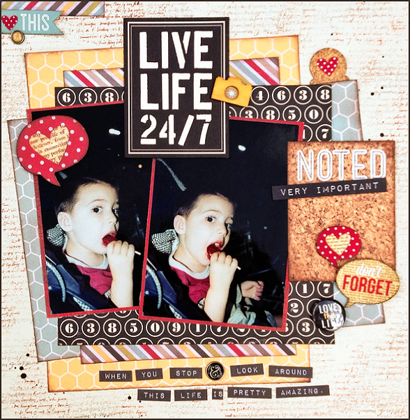
My next page has a bit of a grunge look, beginning with an inked, stamped and misted background. After that I brought in lots of the color, greatly contrasting with the dark, nighttime photos.


The cut-apart cards did the talking for me again...as one stands in for the title. Another is cut up for the quote at the bottom. My own label maker mimics the look as I add the date and place. The label maker went back into the drawer but I left one of its rolls on my washi tape holder...so that I will remember to use it sometime! TFL!

Thursday, June 20, 2013

I *heart* Days Like These

I just LOVE this photo of my son and his closest cousin. He has the biggest smile as they hang out together at a family gathering this past winter. I'm glad that the two see each other often and have developed a good friendship.


Patterned papers are from Echo Park and Lily Bee. The die cut title is a Scraptastic exclusive from a past scrapbooking kit:


Photo corner stickers work as arrows:


It's nice when we are together as a family and the kids have other kids close to their age. It holds off the "I'm bored. When are we going home?" Thank goodness!

Wednesday, June 19, 2013

Stenciling a Giraffe

The blue and yellow color scheme of THIS layout (shared last week) inspired me to create a card for my niece whose little one is due next month. Since she is decorating the nursery in a safari animal theme, I thought a little giraffe would make a cute card addition. These elegant creatures from a recent trip to the zoo were also an inspiration:


After finding images for both the giraffe silhouette and giraffe spots, I was able to cut my base shape and create a stencil with my digital cutter. The wavy lines on the bottom stencil (also used on my card) were cut by hand. As you can see, I also cut out a few ducks in case the giraffe didn't work out  as planned!


Below is a little practice stenciling, using a sponge dauber and pigment ink in Coffee Bean. I wanted to be sure it looked OK on the textured cardstock before proceeding.

 It worked well!


Although the stencil didn't cover the entire giraffe, it was easy to move it around, touching up the legs and head. I finished him off by inking the edges and adding facial details. He came out rather cute!


Background was pieced using scraps of patterned papers from my June Scraptastic kit, Carry On. Not much longer and my parents will be welcoming their first great grandchild!


Friday, June 14, 2013

Tchoukball? Say What?!


You've heard of baseball, football, basketball, even volleyball. But have you ever heard of tchoukball? It was new to me when Kevin's brother came home with a sign-up sheet for the intramural game a few years ago. It was a popular wintertime sport at his school. And now Kevin, attending the same school, has learned how to play the game. It was developed by a Swiss biologist who saw it as a safe alternative to the more injury-inducing sports like football, soccer and rugby.

Here's my page about the sport, created with the Scraptastic's Carry On kit:


I love it when kids are eager to participate in activities that get them outdoors and moving. And tchoukball is a great one for that! They are in constant motion! I've used a painted arrow on the photo below to point out my child in the midst of the action:


This page is also used to introduce the Scraptastic Challenge for this week: Scraplift YOURSELF!

You know you have one...a page that you absolutely love. Maybe it's one where you tried out some new technique...and it worked. Or an inspiring design that really came together. You know, the one that makes you proud! Hey, if it worked once...it should work again, right? I took a recent favorite and scraplifted it for my Tchoukball page. I moved the banner and photo down a bit and stretched that title out over the upper portion of the page, but otherwise, the page design remained pretty similar!

Here's the original. Remember this?


The design is easy to duplicate, so why not?  Compare the pages and see what you think! With a totally different color scheme and subtle differences in design, I've created a brand new layout that I love.

Thursday, June 13, 2013

Great Minds, Right?!

It was rather freaky when I perused the Two Peas Gallery a few days ago and found this layout from Jen Gallagher:


Here's why. This page of mine was sitting on my easel. Can you see the similarities?


I have always admired Jen's style. Isn't it cool that we both created pages somewhat similar in color scheme and design, right down to the corrugated strip across our red, kraft and blue banners?! I promise you, neither of us had seen each other's page. Great minds, right?!


Wednesday, June 12, 2013

Love You

Reaching way back into my photo stack, I found this adorable picture of my youngest son, now 13 years old. He was (and still is) so cute! This photo was so typical of our everyday...play, play, play. We certainly enjoyed our daily routines. In this particular photo, Teddy Bear is the recipient of little Kevin's love and smothering affection. Literally smothering.


Little bits of red are brought into the page, with the large brad at the top...


and the "everyday" strip beneath my journaling:


The little house shaped wood veneer reminds me of my own house! To give it a little color, I swiped a Tim Holtz inkpad over the veneer, a favorite and super easy way to color the embellishment, while leaving the wood-grain visible.

The house veneer and flowers were from my stash,  but everything else is from Scraptastic's June kit and add-on, Carry On.

Wednesday, June 5, 2013

Birthday Wishes...too much?

Uh-oh...is it too much?! In creating this card for my mom's birthday this week, I might have gone a bit overboard. I kept finding little pretties that I wanted to include, and tried my best to limit them to my favorites. 

Of course it needed a doily, a few snippets of patterned paper, and flowers to match. I had this perfect pocket and included in it one of those Mason jars that are all the rage. (I decorated the inside with another one!) Then there's the flags. Finally, there was no room for anything else! Hahaha!


Maybe it's that I don't make cards too often.
Maybe I was trying to pull off all of my ideas at once.


Maybe BECAUSE I don't make cards too often, my mom will realize that this is special.
And I was trying to load it up with everything I love, to show MY love. :)

Tuesday, June 4, 2013

Captain Jack, If Your Please

I don't know about you, but I LOVE all the nautical inspired scrapbook papers and embellishments that are available lately. Anchors and whales, and color schemes that include a true blue make me happy. If you are not a fan of these collections, you must live very far from the shore! ;) 

Actually, these papers have inspired me to tackle more of my Disney photos, those from the POTC attraction. See the journaling? The further out I get from our actual vacation, the less I remember…so a Captain Jack quote (from the movie) says pretty much what we were saying all week...back in 2011. Yep, we'd arrived at a very special place!


On this page I've used a few products from the Fancy Pants' Down By The Shore Collection, including the wonderful stripe and anchor print papers, a large banner, and small tags. The ampersand journal card is from another nautical favorite, Glitz' Uncharted Waters.

One day when I run out of these stitched look fabric Thickers, I'm going to be very, very sad:


The little "tweets" scattered about are so perfectly pirate that I can hear them squalking:

It's a good thing we don't go to Walt Disney World more often. One trip can keep me scrapping for years!

Monday, June 3, 2013

A Day At The Zoo

I'm all over the place when it comes to what year (decade) I choose to scrap next. Today's layout features some really terrible pre-digital age photos that I still felt the need to scrap. Isn't that face adorable?! I had put the pics aside years ago, but challenged myself to "just do it"! My "baby" is 13 now, so it's kind of bittersweet to look back on these pre-school days. 


Papers are from Fancy Pants' Trendsetter collection, which I happened to pick up when I visited a real, true-to-life, brick and mortar scrapbook store recently.

That store was Scrappin' Friendzee. I had found it on a google search a while ago, but didn't have a good reason to seek it out. I lived on the other side of the river (read: other side of the world) from the place, and had no recommendations to spur me to make the drive. But last week Tommy and I had to drive over to pick up a bed frame from a shop on that side, and he asked if there was anywhere else I wanted to go while we were over there. A lightbulb went off in my head, and that's how I found myself wandering the aisles of an honest to goodness scrapbook store! Boy, I've missed browsing paper stacks. Internet shopping has its perks but it's just not the same.

Do you have an LSS (local scrapbook store) where you live?

P. S. Those tags on the top are not actual tags. It's a patterned paper! I cut around the top of the tag images, punched holes, folded to make a crease between each "tag", inked and then pop-dotted the paper on the page! Don't they look real?!