Last week was Pinterest inspiration week on the Scraptastic Blog, with Design Team members rummaging through their Pin boards, choosing inspiring pieces, and creating projects based on those pins. I chose TWO pinned projects to inspire a layout with the Scraptastic Everything I Am kit.
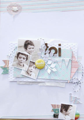
My first bit of "pinspiration" came from the gorgeous page below. Inspired by the white on white look of the layered papers along with the soft pastel color palette, I aimed to combine the same on my page.
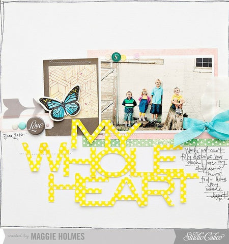
Additional Pinspiration was drawn from the large welded title of the beautiful layout below. It made me want to drag out my die cutting machine and play with lettering!
Here are the results of applying a little inspiration from each of the above pieces to my own page:

The color scheme of my layout was inspired
by the first pin. Popping up some of the white and pastel elements helps
to distinguish them from the background.

The second Pinterest pin inspired me to
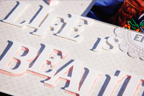
form my own title, by arranging, overlapping and welding letters before
cutting with my diecutting machine. The word "beautiful" was cut from
both white and pink papers then layered on the page, with the top
(white) layer pop-dotted over the pink. It's a great effect!

Check out the Scraptastic Blog for more Pinterest inspiration pieces. Do you have a pin board? What is inspiring YOU lately?


13 comments:
I love the effect of your layered title, Madeline! This is such a fresh and pretty page!
Beautiful work! I need to try the big title idea :)
oh that title work is stunning!!!
Fabulous page! I am really enjoying the whole white on white thing. :) Love your title work and the cool pink sprig of leaves.
Your finished layout turned out great! I love the welded/layered title.
Great title work, love your layout :)
You did a fabulous job with your Pinspiration! Very pretty!
Great inspiration pieces and your layout turned out fabulous based on them!
I love how you were able to stick with the pale and pretty color scheme, I on the other hand try to do it but somehow end up putting in just a bit more color. I am going to try this again, thanks for the inspiration!
Gorgeous! I love the subtle colour scheme - especially the white doily on a white background, with the leaves on top. So pretty! x
Great layouts. Love the way you popped the title for dimension.
I love how you did your title.
Just beautiful. I love the term Pinspiration. Never heard that before!
Post a Comment