Monday, October 29, 2012

Our (Christmas) Tree

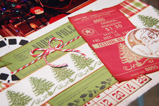
One of my favorite types of patterned paper are those with tickets, tags, receipts, and other cut-out-able artifacts. I used several on a page about my Christmas tree. The journaling block, North Pole receipt, and Festival of Trees ticket, were all part of Echo Park's This & That Christmas collection. On top is a Santa image, punched from another of the collection's papers and adhered to a chipboard circle. Peeking out from these beneath these layers are two more of my favorite paper embellishments, a viewmaster reel and bingo card. I love those little random pieces. They add fun details without the bulk.

Here's my completed page with three little trees randomly cut from various patterned paper:


This year I thought I'd like to take a few pictures of my favorite ornaments. But gosh...where to start?!

Saturday, October 27, 2012

Another Try At Pool Pics

A week after my first attempt at shooting indoor swim meet photos, I had the opportunity to try again. The same venue late in the afternoon offered little to no outside light, but I gave it a shot anyway. I paid particular attention to focus, but still most of my photos were not sharp enough to satisfy me. This was not an easy task!
Thankfully the team's next event will be a Halloween party, outdoors around their practice pool. I hope the weather will be nice so that I can capture some better photos with natural light. 
Here are a few of my pictures from today:


And here's my swimmer. He knocked time off of most of his events, and swam 50 fly for the first time in a meet! Way to go Kevin!


Friday, October 26, 2012

Christmas in July

Christmas-time was hectic and the gingerbread house kit bought last December never was assembled...until I spotted it one hot July morning on the top shelf of the pantry. Putting it together was a fun diversion for a summer day. I snapped a photo quickly, knowing it wouldn't be in this condition for long. Sure enough, bit by bit, it was devoured.


Most of the papers are from Echo Park's This & That Christmas collection, with a few scraps from other papers thrown in for good measure.


Wednesday, October 24, 2012

Packed 2 Go Back

...Back to School that is. My middle son is not fond of having his picture taken, so to document this event, I had to be creative. Thus, it's a back to school layout featuring a photo of the packed car! The initial "A" and "Roll Tide" on the banner hint at his school...the University of Alabama. The guitar in the back of the van tells a little bit about the boy himself.


I began this layout with bits and pieces of October's Hall Pass kit from Scraptastic, adding bits and pieces from prior months' kits as well. I love finding uses for all those little leftovers: a tab here, a sticker there. Paper scraps fashioned into a banner finish the page off nicely.


 Packed 2 Go and off we went...to deliver Chris to his second year. Last I heard, he had 3 As and 2 A+s! WTG Chris!

Tuesday, October 23, 2012

A Day In The Life Pie Chart

In creating today's layout, I first had to work out a little word problem, much like those you dreaded in math class back in elementary school.
If a complete circle represents an entire day, 24 hours, then how many degrees equals one hour?  Answer: 15 degrees.
(See kids, you do make use of that math education later on in life...and I even used one of your old protractors to measure my triangular pieces of patterned paper.)


I figured this would be a fun overview of my 12 year old's daily life, so I wanted the chart to give a fairly accurate representation of a typical day during the school year. Activities such as eating, sleeping, and swimming were each given a different colorful patterned paper, and the amount of time spent doing each was approximated and translated into pieces of the pie. Since sleeping and school were huge portions, I grouped them together and overlapped their pieces with my photo.


In keeping with the clean bright colors of this page, I decided to use pen-stitching in place of inked edges to accentuate the various paper pieces.


Most of the papers used on this layout are features of Scraptastic's Hall Pass kit, but you might recognize a few papers from the last two month's kits. Scraps from Just Beachy and The Story Begins were included to give me a good mix of bright colors and patterns. I love how great the woodgrain paper looks behind those word bubbles.

What do you think of this trend? Have you incorporated a pie chart on a scrapbook page of your own? Do you have plans to try it yourself?


Monday, October 22, 2012

It's A Start

I've never really learned how to use my camera! Yes, it's true. I have had it for almost 7 years and for all that time it has remained on auto and the occasional sports and portrait modes. I learned all about aperture and shutter speed, but never really put it into action, never comfortable with my knowledge, and always afraid that I'd mess up that perfect shot by setting it up wrong. But then I signed up to be team photographer for my son's swim club. Uh-oh. Their first meet will be at an indoor facility NEXT WEEK! I had to step up my game and take it off auto once and for all. 

Thankfully, this weekend I had the opportunity to practice during a school meet at the same pool. Eh...they aren't great pics. But I got non-flash photos in a place where I would have never tried before. And I learned quite a bit more about my camera. I also learned that I need another lens if I want low light action shots! And focusing is a big deal that requires a lot more practice from me. 

Here are a few of my pictures from this weekend. Not stellar. Some were a bit dark and somewhat grainy. But I took it off of auto and that's a start.

If you shoot indoor sporting events with success, I'd love some tips and lens recommendations! (It was impossible to freeze the action with my set-up.)


Thanks for looking!

Tuesday, October 16, 2012

DIY Sheer Flowers


Although I scrap a lot of boy pages, every once in a while I go searching for that little something to make a page a bit more fancy or feminine. Yes, I have a few flowers, but most are too casual, usually made of paper, and just don't have the softness that I am sometimes seeking. While I admire the gorgeous sets of Prima flowers that are found in stores and on websites, the price always deters me from the purchase!

But, recently, as I was straightening up my scrap stash and clearing out some old supplies, I came across a box of fabrics...tulle, organza, etc., and I remembered a little technique I'd learned a long time ago. When many of these synthetic fabrics encounter heat and flame, they sort of melt, their edges curling up and shrinking. Tulle is one such fabric and this property makes it perfectly suitable for creating sheer, layered flowers that resemble some of the more expensive Primas. I shared the technique for creating these beauties on the Scraptastic blog.

Here's a recently completed project, where I used a single blue bloom to add the bit of femininity I desired.


The pretty blue flower contrasts nicely with the lightly inked chipboard.
a
Here's a closeup of the stamp banner detail, an idea borrowed from the Sweet Paul blog.
These fancy flowers are so easy; you have to try them yourself!

Monday, October 15, 2012

Kindergarten Memories

Several years ago Kevin and his kindergarten classmates brought home a wonderful memory book that the teacher had assembled for each child using photos and art projects from throughout the year. With its gluestick and construction paper structure, I knew it needed to be preserved in another fashion. I recently took apart the booklet and began my project, carefully scanning his artwork and photos. Today I am going to share two pages that I have created as part of this process, using the fabulous papers and embellishments from Scraptastic's Hall Pass kit.

  
This first layout centers around a questionnaire that each child answered about themselves. Because the teacher wrote in all their answers for them, saving the original paper was not important. The questions and my son's words were printed on a strip of neutral cardstock that had been distressed with Studio Calico Mr. Huey's, Letter Jacket from the Hall Pass add-on and Pinstripe, a nice grey that I had on hand. Strips of various widths were arranged on red cardstock with a thin line of color peeking between each.


 A photo and additional red accents were added: stickers, banner pieces, tabs, arrows and an awesome "hello" photo frame. Popping up the wood veneer word bubble over a darker paper helps it to be more readable. With the wealth of Thickers and letter stickers in the Hall Pass kit and add-on, I was able to have not only a title, but a subtitle as well!
 
 
My second page rescues a large class photo that had been glued into the booklet. After carefully peeling it off the construction paper page, I adhered it to piece of grey cardstock, giving it a narrow frame. Next I used the red wood-look patterned paper as my page base, to coordinate with all those red sweatshirts in the photo itself. But between the two, the background and red sweatshirted kids, I added all sorts of patterns and colors. Several of the flash cards were layered underneath the picture, with the one holding my journaling overlapping on top.

 
Then I got busy with a few office-inspired embellishments, and added the "Good Morning" wood veneer word bubble as if the teacher was greeting her class.


I rubbed the wood veneer with Tim Holtz Distress Ink (mustard seed) to get that nice deep yellow, which then inspired my title. "Classmates", cut from the kit's yellow cardstock, was altered to match by inking the word and spreading a thin layer of Distress Stickles (mustard seed) over the letters. I love how it turned out!

It feels great to be on my way to preserving these special memories of my youngest son's early school days.

Monday, October 1, 2012

Priceless!

With one of my four sisters living out of town, her visits to New Orleans are nicely anticipated occasions. At some time during each stay we have a day out with my mom. Of course it usually involves a nice lunch followed up with some sort of adventure. 


On this warm day in August, we decided to walk around the French Quarter and enjoy a bit of the city where we don't often venture, peeking in a creepy VooDoo shop, relaxing in Jackson Square, and taking lots of picture of the streetscape before us. I even managed to get into one of those photos:


The textures of the French Quarter are all so lovely together, with a building's worn wood and stained stucco offering a pretty backdrop. This inspired me to use a woodgrain patterned paper as a background for my scrapbook page, with an assemblage of bits and pieces on top. I overlapped envelopes, tags, notebook paper, a library card, bingo card and receipt for a casual look.


The "Guest Check"  holds journaling in the style of those old MasterCard "priceless" commercials.
Lunch @ The Gumbo Pot,
Window shopping in the French Quarter
A fun day with my mom, sisters and the 3 youngest cousins...
PRICELESS!

Finally, a very old tape transfer technique was used for my "fake washi", seen above and below.


This technique was used on a lovely page by LG Belarmino HERE. She got the idea from a Pinterest pin which linked to THIS tutorial. I remember using this technique years ago to transfer images. And as for making your own pretty tapes, it's quite handy for those times when you want the washi look, but just don't have the color tape you want.